
Designing for Android vs iOS

Start Thinking About It Early On
Day to day, the most awareness a user will have of their specific operating system is very minimal. They will take note when downloading an app on their respective stores or syncing a system update. They notice when their group messages are all blue (yay all iOS!) or green (who let that Android in here?). Maybe they will get excited at the sound of a notification ping only to see a shell of a message reading: "Jennifer liked Karen’s message: ‘Baking bread today.’” No thank you iOS iMessage, you can keep your “likes”.
Users didn’t develop a high-level awareness of their operating system because, for the most part, designers and developers have done the work to make it disappear. They’ve intentionally blended their app interface with system functions and frameworks that make the app feel like an extension of the device, therefore “hiding” the operating system. It’s a given, then, that designers must continue to know and design for the differences in these systems to achieve usability.
When a client decides to build their app using native frameworks instead of hybrid or web, designers must immediately think dual platform when it comes to design. This type of thinking will better direct decisions that impact usability–workflows, layout decisions, navigation patterns, icon use. Bring anticipatory thinking front and center, giving it more weight in every design decision. Doing so smooths out workflows, keeps the focus on performing tasks, and accomplishes the top usability.
Why does this matter to designers?
Let’s back up. What is an operating system and why do designers need to design differently for each system?
An operating system (OS) manages and executes common services for programs. It coordinates and allocates hardware and software resources across applications, serving as a bridge (or a gatekeeper) between device hardware and an app’s software. Different operating systems use different methods to allocate resources or execute tasks via hardware. That’s why devices running on Android behave differently than those running on iOS, and why designs must take both into consideration.
Here’s an example illustrating how the UI interacts with different operating systems. Instagram provides an ellipses icon to signal additional actions for a post (1). That ellipse’s styling and actions are owned and presented by the Instagram app. The menu of items displayed is styled and owned by the operating system (2). The list of buttons may look similar on each platform’s app because it includes tasks that are valuable to both Android and iOS users.

Let’s go further. When the user clicks the “Share to...” button, both operating systems launch a slide-up drawer stocked with different sharing controls. Note how Android allows users to share to a direct message (3), pulling and displaying recent contacts from multiple messaging apps (the Pixel Messaging app and WhatsApp). iOS, on the other hand, only highlights recent individual messages from their iMessage app. iOS also prioritizes sharing via AirDrop. Since that’s not part of the Android operating system’s capabilities, it’s not presented as an available sharing control.
These may seem like subtle differences, but the services an operating system allows and promotes affect how your app is used across platforms. Awareness of these subtle differences should be considered when designing. A very simple example of this type of consideration is demonstrated in how Instagram labels their “share” button as purely “Share to…,” it doesn’t specify “share to iMessage” or share to “WhatsApp”. That wording keeps the share button iOS/Android neutral and allows the operating systems to dictate how the user can share that post.
Successful cross platform designs should craft similar experiences for your users. Design workflows and visual components that work similar on both operating systems. Would an iOS user be able to easily show a friend on the Android app how to complete a task? The answer should always be yes. Consistency strengthens perceptions of the product.
Working With Design Frameworks
Android and iOS developed separate design frameworks for app design: Material Design for Android, and Human Interface Guidelines for iOS. These recommended design standards advise which app layouts, workflows, and component behavior will integrate well with their operating system and controls. Leveraging these guidelines creates a stronger user experience because your application feels more “native” to the device, blending system patterns with your app design.
Here are a few top-level examples of design framework differences to consider when designing across operating systems.
Headers, Action Patterns, and Top Navigation
iOS and Android defer to distinct navigation patterns and layouts. When designing and building interaction patterns, think about how headers and navigation will translate across apps. Keep it as simple and consistent as possible.
Android uses a combo of hamburger menus and bottom bar navigation. Its header structure stays consistent, with an action icon (hamburger menu, back arrow) on the far left, followed by a header label, then up to three secondary action icon buttons on the right.
iOS uses a header pattern that relies on an arrow and navigation button on the left, title in the middle or below, and a single secondary action button on the right. Few icons are used at all compared to Android; iOS prefers hyperlinked labels.
As a simple example, to design your application’s header in a way that translates best across both Android and iOS, incorporate only one secondary action into the header. Even though Android suggests you may have up to three action icons in the top right of the header, you’re restricted by the iOS Human Interface Guidelines which recommends only one secondary action button.

Components
The components for each operating system are important tools to leverage when working to make an app feel more like an extension of the device. Proper integration increases usability because it calls on a familiar pattern, the user knows what to expect and how to interact.
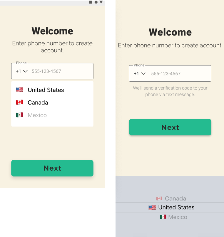
For example, iOS uses a wheel picker, while Android uses a floating dropdown. When designing to incorporate these elements, designers must consider how the different implementation affects the amount of spacing, color incorporation, and navigation designed into the data fields.
Picker placement may, in turn, affect navigation button placement. In the following image, the Android picker doesn’t obstruct the bottom Next button. However, the iOS wheel picker would end up covering the Next button, so it was raised up to ensure frustration-free advancement.
Icons
Icons are one of the most visible ways to tie your app to the “native” experience of the operating system. Knowing each platform’s preferred icon set (Material for Android, SF Symbols for iOS) makes it easy to visibly spot the differences between an iOS version app and an Android version. Variances in iconography can be challenging, as the icons differ in size and symbol.
When choosing icons, check what’s available in each icon set to maintain maximum consistency. Of course, one way to sidestep this balancing issue is to use a platform independent icon set. This is a great way to differentiate the style of your app from the system guidelines, while still tapping into native workflows and components that lend itself to consistent UX. It really depends on the project.

The Opportunities
Although it takes sometimes tedious intentional planning and iterating, designing for cross-platform presents exciting visual design opportunities. Create a visual style that feels neither iOS or Android, while still incorporating select system components. This will allow you to maintain more consistency across platforms and provide some freedom to break away from certain system standards. Push for more creative solutions in style, mobile patterns, and custom components, instead of reverting to the system standards.
A Framework
Finally, here are some resources and technical steps we take to prepare and execute cross platform apps.
Start by absorbing the system framework standards.
· Android: Material Design
· iOS: Human Interface Guidelines
Review your workflows and document where they may have to slightly differ based on navigation patterns, platform specific permissions, or minor differences in functionality. This will help serve as a map for developers as well as a reminder for yourself when you’re in the thick of designing.
We use platform specific “sticker sheets" as a starting point to stylize and insert the proper components where needed. Doing so allows us to see how the system components integrate with our custom designs, testing whether they fight or complement each other. Most UX design programs (XD, Sketch, Figma) have resources for downloading these specific sticker sheet templates. We build custom components for major design elements such as cards, navigation menus, logs and lists, etc. We stick with system components like dialogs, pickers, controls because we don’t need to recreate the wheel.
In Summary
The execution of design details will make your app successful on both iOS and Android. The broad stylistic decisions, high-level workflows, and main components will seamlessly transfer. But the system compatible aspects are what elevate an app experience. Getting those right accomplishes the UX goal of making the interface disappear, framing it as an extension of the device. That way, the user can focus on the task at hand instead of figuring out how to master the tools to complete the task.

Emma Aversa is a visual designer at KRUTSCH, with a background in architectural design. She excels at digital design and communication executed through simple, function-forward designs.